The story behind a logo.
We were hiking through the Bagaces Canyon of the Guanacaste region of Costa Rica and I wasn’t sure if I had ever sweated more. The muggy air of the rainy season paired with a tropical 90-degree heat meant the hike up to the overlook was stifling. I was at the front of our group, ears straining for every detail our local guide had to share about the foreign plants and animals we were encountering.
Despite the language barrier, Juan Diego was an expert communicator, armed with a visual guide of flora and fauna that might cross our path. I had hopes for sloths (wrong region) and monkeys (checked that box and then some), but he dazzled me with termite mounds, “Jesus Christ” basilisk lizards (they walk on water), and a small tapir that looked like some blend of a piglet and anteater.
My photo album is a collection of strange fruits and insects, attempts to catch an animal on the move, and jungle scenery that seemed to serve as inspiration for the imaginary world of Avatar.
Lindsay and I came to Rio Perdido in Costa Rica for a wellness retreat and to seek direction as we near the conclusion of our third year of TealHaus, but it is no surprise to anyone that what we took home was far more inspiring.
But today I am thinking of a question I asked Juan Diego while we were hiking.
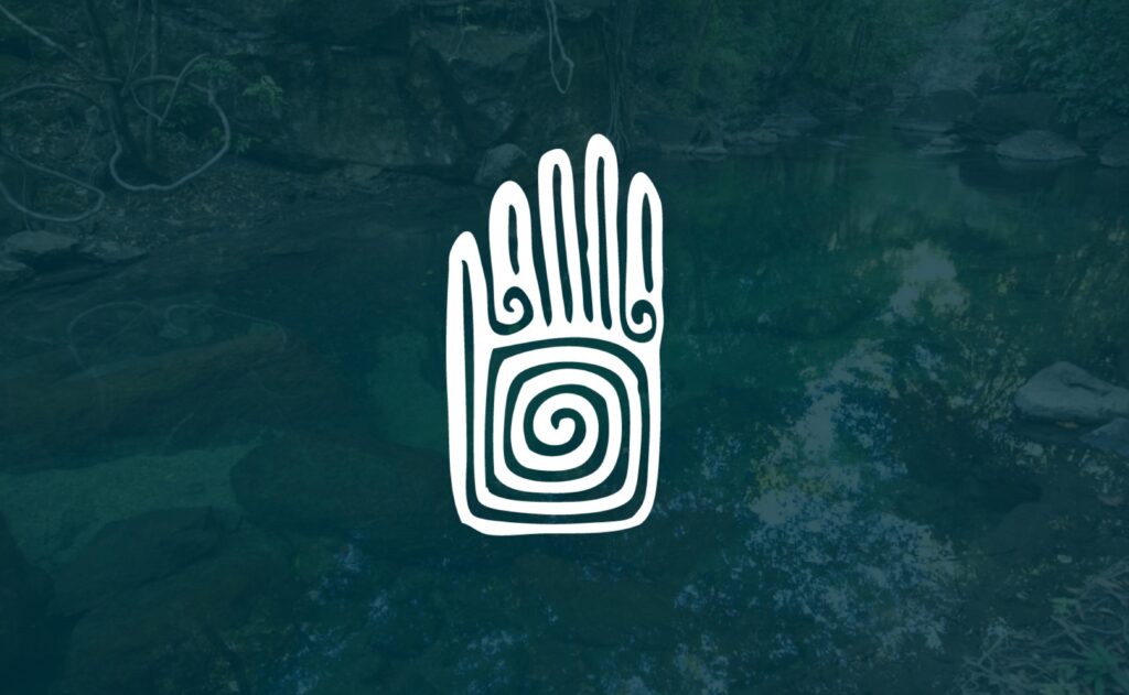
What was the meaning behind the logo of Rio Perdido?
As a marketer and generally curious person, I had to know.
The logo depicts a primitive hand with concentric circles where the palm would be. Juan Diego explained that the sign on the palm was a way the Cabecar tribes indicated there was water there centuries ago. And not only was there water to drink, but also a thermal gorge considered to be sacred to the indigenous peoples.
The founders of the development found a rock with the symbol carved into it while exploring the vast landscape. (Can you imagine their surprise and delight?)
Hotel Rio Perdido sits at the meeting point of two rivers: a thermal river (Rio Perdido) warmed by the volcanoes nearby and a cool river called the Rio Blanco.
The five fingers symbolize the developers who created this paradise (less mystical and interesting, but still meaningful).
I shared what I learned with Lindsay while we were hiking back down the mountain. The brand for Rio Perdido is not just a clever design or trendy take on something we have seen before. It has a beautiful connection to ancient, life-giving symbols while honoring the team behind it. It bridges the gap between the deep history and respect for the environment and the modern application to enjoying it.
Don’t you want your brand to carry that kind of impact?
When we are working on a rebrand for a client, we don’t put the proverbial pen to paper on a design until we have completed a discovery process that helps us nail down the story we are trying to tell. This story must be so compelling that the imagery our design team creates can flow from it. It visually conveys what we have established as the “why” behind the brand.
Is your brand doing that for you? If not, let’s change it.
Creatively written by
Kate Dabbs
President